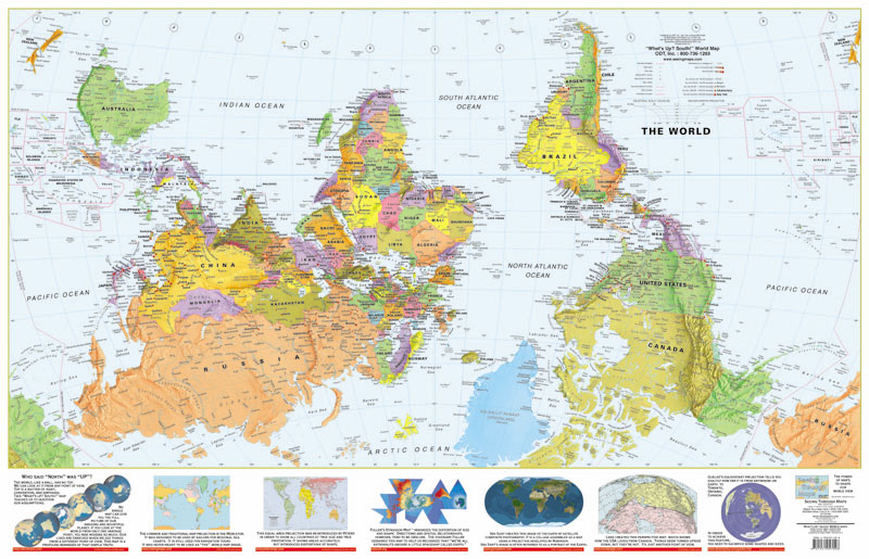
We feel “up” when we’re happy and “down” when we’re sad, Christians talk about up in heaven and down in the pit of hell, and Billy Joel’s downtown man covets an uptown girl. The north-south bias is a spatial metaphor that applies to real estate on many global levels: “Metaphors are used to help people understand abstract concepts in terms of perceptual experiences (e.g., “feeling high” or “feeling down”). A consequence of this strategy is that metaphor can bias perception and decision making. For example, consistent with metaphors for affect and spatial perception (up = good, down = bad), people more readily identify positive things when high in location. North and south are abstract concepts, which are also tied by metaphor to spatial perception (north = up, south = down)” (source).
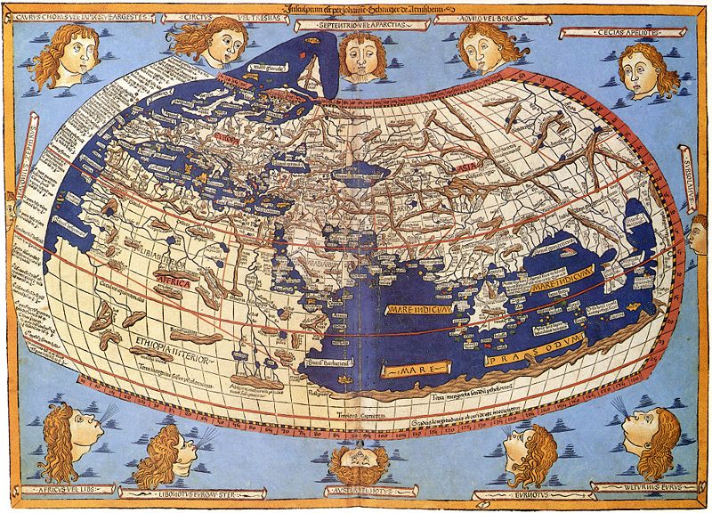
“Most modern-day maps typically show an orientation with north at the top of the two-dimensional depiction. In other eras, different directions at the top were more prevalent, and all directions have been used by different societies and cultures to depict our world. The biggest factors that contribute to north being commonly placed at the top of a map include the invention of the compass and the understanding of magnetic north and the egocentricity of society, mainly in Europe. The discovery and use of the compass in Europe in the 1200-1500s may have greatly influenced many modern-day maps with north at the top. A compass points to magnetic north, and Europeans, like other cultures long before, noticed that the earth spins on an axis that is relatively pointed at the north star. That idea, combined with the concept that when we look up we see the stars, contributed to north being placed up at the top of maps, with words and symbols being placed relative to that viewpoint.
Egocentricity is having a view or perspective that revolves around you or your situation at the center. Thus, in cartography and geography, an egocentric society is one that places itself in either the center of a depiction of the world or at the top. Information at the top of a map is commonly viewed as being both more visible and more significant. Since Europe was a powerhouse in the world, producing both heavy exploration and the printing press, it was instinctual for European mapmakers to put Europe (and the Northern Hemisphere) as the focus at the top of maps. Today, Europe and North America remain dominant cultural and economic forces, producing and influencing many maps – showing the Northern Hemisphere at the top of the map. Most early maps, before the wide-spread use of the compass, placed east at the top. This is generally thought to be due to the fact that the sun rises in the east. It was the most consistent directional maker.
Many cartographers show what they want to be the focus at the top of the map, and, therefore, influence the orientation of the map. Many early Arab and Egyptian cartographers placed south at the top of the map because, having most of the world they knew of to the north of them, it drew the most attention to their area. Many early settlers of North America created maps with a west-east orientation that resulted from the direction that they primarily traveled and explored. Their own viewpoint greatly altered the orientation of their maps. In the history of mapmaking, the general rule of thumb is whoever made the map is probably at the center or the top of it. This rings mostly true for centuries of mapmaking but has been greatly influenced as well with European cartographers’ discovery of compasses and the magnetic north” (source).