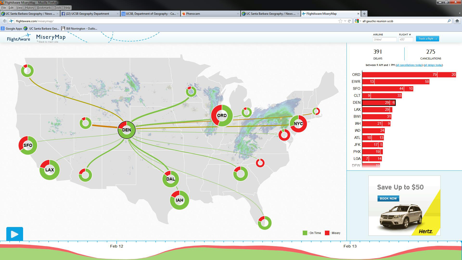
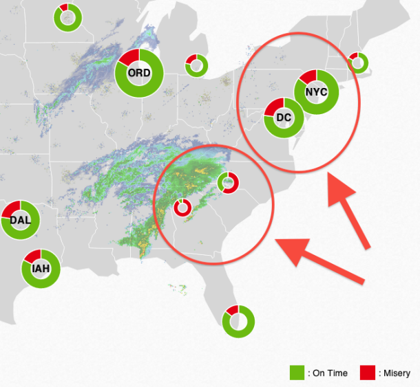
The FlightAware MiseryMap is an interactive visualization of the state of US flight delays and cancellations. “With more than 6,000 flights within the nation canceled today and more than 1,000 delayed because of the snow and ice storm moving up the East Coast, it’s time once again to point to FlightAware’s MiseryMap.
As All Tech Considered has explained before, the map ‘combines weather and flight data into a live map that lists which airports are being struck by storms, the number of delays and cancellations, and graphs that show flight destinations and the chances they’ll actually make it on time.’
The more red you see in the circle over an airport’s location, the more miserable things are there for travelers. It looks like there’s plenty of misery to go around” (Mark Memmott, writing for npr.org, February 13, 2014).
Editor’s note: Many thanks to Geography grad student Boleslo E. Romero for suggesting this material and to Academic Personnel Analyst Bernadette Weinberg for passing it on to the editor.
If you would like to be on our mailing list of latest news postings, or if you have anything relating to the Department that you consider noteworthy, interesting, or just plain fun that you would like to share, please contact the news editor News Editor