Launched in 2004, the Ask Dr. Map web site contains answers to questions about maps submitted to Dr. Map, the “anonymous” author of the column Ask Dr. Map, printed bi-monthly in the ACSM Bulletin. The following column, titled “Expenses and Loss,” is from the ACSM Bulletin #251, available online later this month:
Q: Dear Dr. Map: What are some of the most expensive maps in the world?
A: Maps have value as works of art and science, and so become the prizes of collectors worldwide. Like any other form of collecting, it is the rare, the old, and the beautiful that command the highest prices. In 2001, with much fanfare, the Library of Congress paid $10 million for the Waldseemüller map. The map, Universalis Cosmographia, is a printed wall map on a modified Ptolemy II projection by German cartographer Martin Waldseemüller, originally published in April 1507. The modification to the projection was to fit in the Americas and the high latitudes, which are rather squished in at the fringes. The map is one of a kind, although other copies of the same map as globe gores exist. It is famous for being the first to label the new world as “America,” after explorer Amerigo Vespucci. Just think, if Waldseemüller had made a different choice, we could all be living in the United States of Vespucciland!
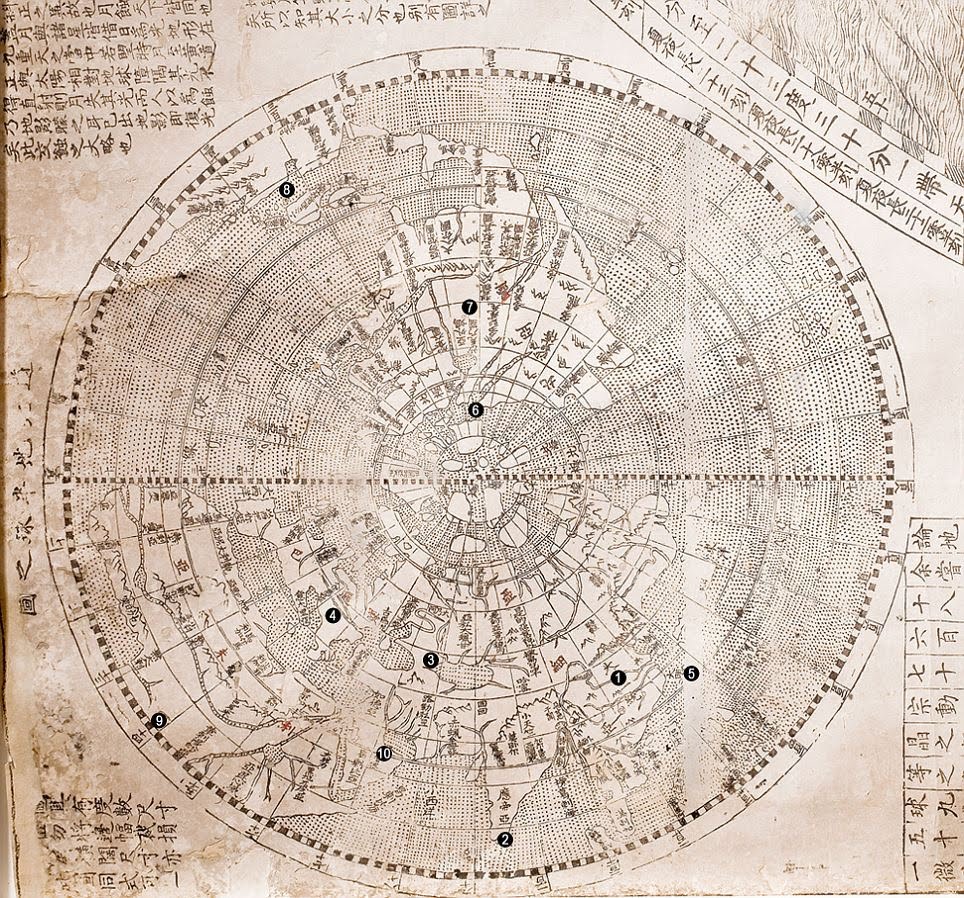
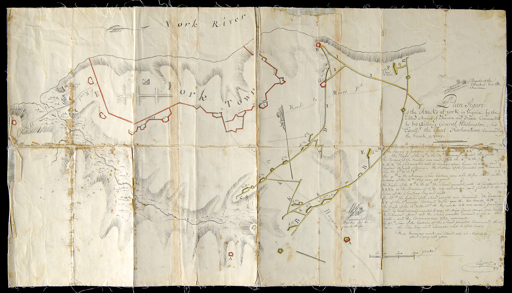
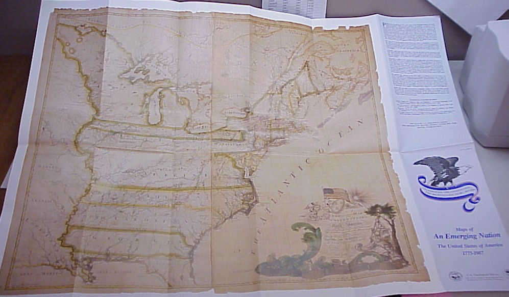
Other expensive maps include the Ricci world map, for which the James Bell Ford Trust paid $1 million in February 2010. This map, by Matteo Ricci, an Italian Jesuit priest and founder of the Jesuit China Mission, was drawn in Zhaoqing, China in 1584. It was the first European style map of the world in Chinese. No versions of the 1584 map survive, but some six copies remain of a version of 1602, printed on rice paper. A map of the Battle of Yorktown was sold at auction for $1.15 million in 2010, the most paid at auction for any map. The map, hand drawn at the direction of Jean Baptiste Gouvion (who took part at Yorktown), was completed just days after the battle took place and is believed to have been used by General George Washington. The Yorktown map’s record stood until later in 2010 when a 1784 map by Abel Buell went for $1.8 million. The Buell map, entitled “A New and Correct Map of the United States of North America Layd Down from the Latest Observations and Best Authorities Agreeable to the Peace of 1783,” is said to be the first map of the United States published in America. It was bought by philanthropist David M. Rubenstein who has lent it to the Library of Congress.
So there you have it. For a mere $13.95M you could have all four! Or, for free, you could visit at least some of them at the Geography and Map Division, Library of Congress.
Q: Dear Dr. Map: I heard that the United States is shrinking. Is that true?
A: The United States is indeed shrinking and has been since 1940 when the Census gave the area as 3,554,608 square miles. In 1990, it was 3,536,278 square miles but by 2000 gained back 1200 square miles, about the size of Rhode Island. Yet the new 2010 census gave an area of 3,531,905 square miles, 0.64% less than in 1940. Why is this? There are three causes: (1) changes in the way the Census includes the ocean and water bodies in the land area; (2) superior measurements due to better mapping technology; and (3) actual loss of deltas, wetlands, and cliffs due to erosion.
Since 2000, the nation’s territorial waters increased from 256,645 square miles to 264,837, a massive increase of 3.2%. A big land loser was Louisiana, which decreased in size by 350 square miles but gained 500 square miles of water. Sea level rise due to global warming was at least a contributing factor to America’s shrinking. Dr. Map is reminded of King Louis the XIV of France, who, when shown the new Cassini map of his country, stated “I am sorry to see, gentlemen, that your journey has cost me a good part of my kingdom!”
Editor’s note: Many thanks to the anonymous Dr. Map for permission to post this material!