The following is a University of Sydney news article written by media adviser Jocelyn Prasad and posted August 12, 2015, with the title: “Big Data Maps World’s Ocean Floor”:
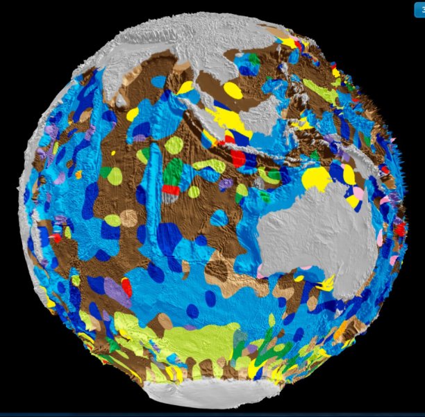
Scientists from the University of Sydney’s School of Geosciences have led the creation of the world’s first digital map of the seafloor’s geology. It is the first time the composition of the seafloor, covering 70 percent of the Earth’s surface, has been mapped in 40 years; the most recent map was hand drawn in the 1970s.
Published in the latest edition of Geology, the map will help scientists better understand how our oceans have responded, and will respond, to environmental change. It also reveals the deep ocean basins to be much more complex than previously thought.
“In order to understand environmental change in the oceans we need to better understand what is preserved in the geological record in the seabed,” says lead researcher Dr Adriana Dutkiewicz from the University of Sydney. “The deep ocean floor is a graveyard with much of it made up of the remains of microscopic sea creatures called phytoplankton, which thrive in sunlit surface waters. The composition of these remains can help decipher how oceans have responded in the past to climate change.”
A special group of phytoplankton called diatoms produce about a quarter of the oxygen we breathe and make a bigger contribution to fighting global warming than most plants on land. Their dead remains sink to the bottom of the ocean, locking away their carbon.
The new seafloor geology map demonstrates that diatom accumulations on the seafloor are nearly entirely independent of diatom blooms in surface waters in the Southern Ocean. “This disconnect demonstrates that we understand the carbon source, but not the sink,” says co-author Professor Dietmar Muller from the University of Sydney. More research is needed to better understand this relationship.
Dr Dutkiewicz said, “Our research opens the door to future marine research voyages aimed at better understanding the workings and history of the marine carbon cycle. Australia’s new research vessel Investigator is ideally placed to further investigate the impact of environmental change on diatom productivity. We urgently need to understand how the ocean responds to climate change.”
Some of the most significant changes to the seafloor map are in the oceans surrounding Australia. “The old map suggests much of the Southern Ocean around Australia is mainly covered by clay blown off the continent, whereas our map shows this area is actually a complex patchwork of microfossil remains,” said Dr Dutkiewicz. “Life in the Southern Ocean is much richer than previously thought.”
Dr Dutkiewicz and colleagues analysed and categorised around 15,000 seafloor samples – taken over half a century on research cruise ships to generate the data for the map. She teamed with the National ICT Australia (NICTA) big data experts to find the best way to use algorithms to turn this multitude of point observations into a continuous digital map.
“Recent images of Pluto’s icy plains are spectacular, but the process of unveiling the hidden geological secrets of the abyssal plains of our own planet was equally full of surprises!” co-author Dr Simon O’Callaghan from NICTA said.
This research is supported by the Science and Industry Endowment Fund. The digital data and interactive map are freely available as open access resources.
Editor’s note: Alumna Dawn Wright notes the following:
There has been a lot of press of this particular study, and the claims in press releases from this particularly university are actually quite controversial and ruffling feathers in the seafloor mapping community. The claims to have made the “first digital map of the geology of the seafloor” and the “first time in 40 years that the composition of the seafloor has been mapped” are a bit misleading. For example, Harris et al., representing GRID-Arendal, Conservation International, and Geoscience Australia actually did this in 2013 (web site, story map) and published their results in a 2014 paper, although their map is about the geomorphology of the seafloor (geology in terms of shape and structure of the rocks and sediments). The claims of the current authors are more along the lines of geology in terms of the composition of sediments. They draw some important conclusions, especially about diatomaceous ooze. Still I would feel better about their claims to be “first” if they had referenced the prior work of others, such as the SedDB project, GeoMapApp, and Global Multi-Resolution Topography (GMRT) syntheses at Columbia University or dbSEABED at U. of Colorado, both of which have been in existence for many, many years, making global digital maps along the way. And the work at Columbia is done at a facility headed up by UCSB alumna Suzanne Carbotte, who was a student of Ken Macdonald’s in Earth Science and a graduate student collaborator of mine on my UCSB dissertation.