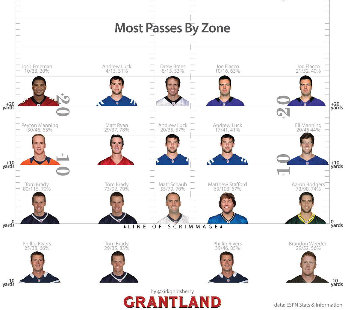
Alumnus Kirk Goldsberry (PhD 2007) is a visiting scholar at the Harvard Center for Geographic Analysis and an assistant professor of Geography at Michigan State University. He is also the creator of many analytical tools that emphasize data visualization, including a “CourtVision” series of maps that chart scoring data for NBA basketball players (see the June 12, 2012 article, “Alumnus Kirk Goldsberry Featured in New York Times – Again!”). The following is an article he wrote for the Harvard Business Review on September 30, 2013, titled “The Importance of Spatial Thinking Now”:
In its 375 years, Harvard has only ever eliminated one entire academic program. If you had to guess, what program do you think that was and when was it killed off? The answer: Harvard eradicated its Geography Department in the 1940s, and many universities followed suit.
The timing couldn’t have been worse, really. Shortly after the elimination of Geography here at Harvard, the discipline underwent a quantitative and computational revolution that eventually produced innovations like Google Maps and global positioning systems, to name just two. Seventy years later we are paying for a prolonged lack of spatial thinking at American universities. There are too few classes that enable learners to improve their spatial reasoning abilities, with maps and visualizations being of course the most central artifacts to such improvements. The problem is simple: not enough people know how to make maps or handle spatial data sets.
In the meantime, spatial thinking, visualization, contemporary cartography, and the other core competencies of geographic education have never been more relevant or necessary. As this forum has made clear, data visualization is an emerging, important discipline, and spatial thinking—geography—is a fundamental skill for good data visualization.
When talking about data visualization, many begin with the assumption that it’s a new thing, freshly formed in this big data era. Visualization is not new, and it’s much older than the “Napoleon’s March” example cited by Edward Tufte as the best information graphic. For centuries, people have measured and mapped out worldly phenomena. We were collecting and mapping information long before the printing press. Libraries supply us with limitless evidence of visualization masterpieces that predate any automated computation, let alone big data, like Gerardus Mercator’s revolutionary map of the world in 1569.
That’s not to say nothing’s new about this moment in time. What is new is the recent integration of spatial thinking and computing. The current rise of what I prefer to call computational visualization is an obvious and logical extension of human practices that are as old as lines in the sand. But this idea that visualization is new hinders teaching and learning about the act of visualization. Without the proper context, “dataviz” discussions and “data science” curricula neglect the important lessons and huge contributions from the past, contributions that can inform everything from design principles to teaching and learning.
As I look out on the world of data visualization, I see a lot of reinventing of the wheel precisely because so many young, talented visualizers lack geographical training. Those interested in a 21st century career in visualization can definitely learn a lot from 20th century geographers like Jacques Bertin, Terry Slocum, and Cynthia Brewer, and they will identify pre-existing principles, cognate scholarship, and countless masterpieces that are extremely useful guides.
Which brings us back to the sheer lack of geographical training available. Recommitting to a geography curriculum in both our high schools and universities will be crucial to effectively developing a generation of great data visualizers who can tackle our challenges. Quantitative spatial analytics offer vital insights into the world’s most important domains including public health, the environment, the global economy, and warfare.
Without geography—or any teaching that emphasizes spatial thinking—the focus will remain on the data, and that’s a mistake. Yes, data are undeniably important but they are not holy. Data are middlemen. Even the term “data visualization” overemphasizes the role of the middleman, and mischaracterizes the objective of the activity. Nobody wants to see data; nobody learns from that. The best visualizations never celebrate the data; instead they make us learn about worldly phenomena and forget about the data. After all, who looks at the Mona Lisa to think about the paints?
Editor’s note: Many thanks to Zia Salim, a doctoral candidate in the SDSU/UCSB Joint Doctoral Program, for suggesting this article.
Addendum: Don Janell, Researcher and Program Director for the UCSB Center for Spatial Studies, just wrote to say, “I should note that Kirk is no longer at Harvard and has resigned his position at Michigan State. He has signed up with one of the sports channels (not sure which one — there was a bidding war) and has a major presence in the sports blog world.” You can check out some of Kirk’s most recent sports applications of data visualization in his blog on www.grantland.com.


