The following is a Wired.com article written by Betsy Mason and posted on May 22, 2015:
An unprecedented effort to map the seafloor bordering California’s coastline has produced some of the most detailed, beautiful, and useful maps of an underwater landscape ever made. No fewer than 18 state and federal agencies and institutions led by the US Geological Survey banded together to make these maps. A staggering amount of work went into the California Seafloor Mapping Program, and the results are impressive. “Nowhere else in the world are people pursuing comprehensive seafloor mapping at this scale,” said USGS geologist Sam Johnson, the agency’s lead scientist on the project. “It’s really unprecedented globally.”
The maps could be important for studying things like navigation safety, coastal erosion and sea level rise, fisheries, and earthquake and tsunami hazards. The maps have already yielded a ton of new information for scientists, along with a few surprises. For example, in Bodega Bay, the San Andreas fault is actually located about 800 meters away from where it was thought to be.
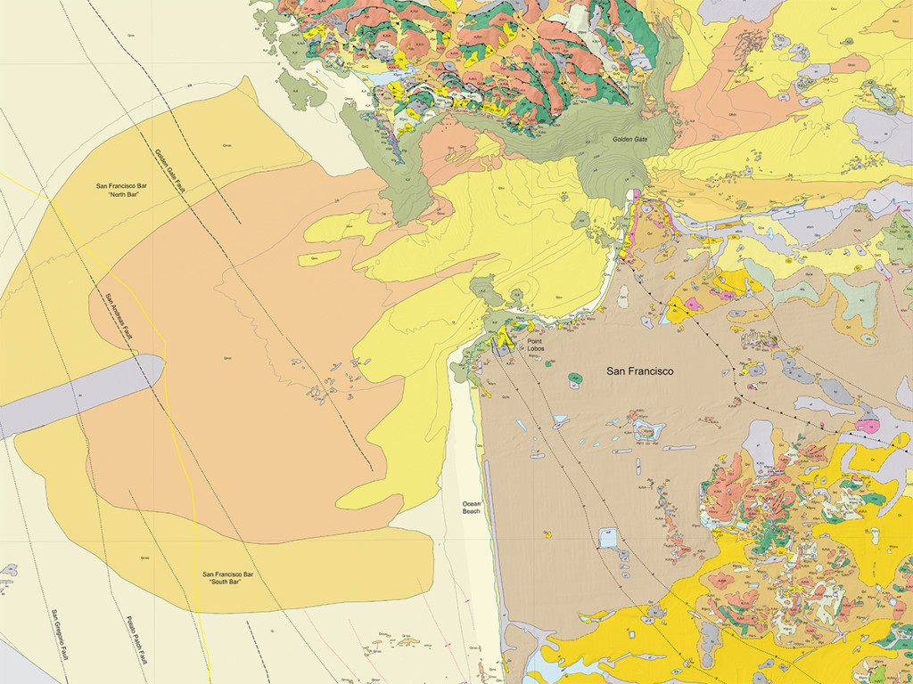
The scale of the project, started in 2007 by the California Ocean Protection Council, is staggering. For 83 blocks of seafloor, each stretching 3 nautical miles from the shoreline, ten different maps are being made of the bathymetry (underwater topography, as seen in the color shaded-relief map of San Francisco Bay at the top of this post), geology, and ocean floor biological habitats. The maps are based on a wide range of data collected since 2007, including swath sonar data, acoustic backscatter, seismic-reflection profiles, seafloor photos and video, and samples of the seafloor sediment. Pretty much the only thing they didn’t use are the Navy’s trained dolphins.
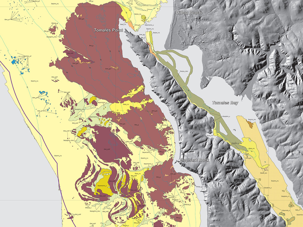
All the data collection and mapping has been completed, and the USGS is in the process of releasing the maps and related reports to the public. Today the maps for the Bay Area, Tomales Point, and Drakes Bay were published. A total of 12 blocks have been released to date, and Johnson expects the next ten to be available by October.
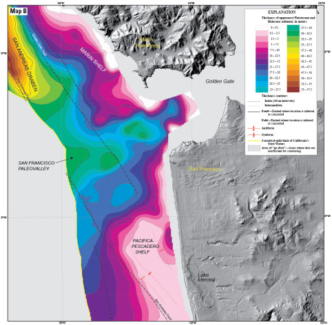
If your first reaction to these maps is an urge to print them out and hang them on your wall, you’re not the only one. Johnson says the map of offshore San Francisco shows off some “sensational geography,” including a deep scour pool beneath the Golden Gate, the first detailed mapping of the Bay’s sand waves and an offshore sand bar known as the Potato Patch. Maps of the geology below the surface down to 100 meters reveal a big paleochannel through which the Sacramento River flowed around 21,000 years ago when sea level was about 125 meters lower.
But in addition to being very cool to look at, the maps contain a lot of potentially important detail. Johnson’s group at the USGS studies earthquake and tsunami hazards and is working on producing maps that show in detail where the offshore faults are. For the first time, they can see precisely how long offshore faults are and whether they are connected to each other.
This kind of information is critical because the magnitude of an earthquake is determined by the length of a fault that ruptures. Longer faults are capable of bigger quakes. If two smaller faults that were thought to be separate are actually connected, they could potentially rupture together to cause a bigger earthquake than previously thought. Discoveries of that sort could even change the USGS’s seismic hazard forecast for California.
One place the data is already leading to new discoveries is near the Diablo Canyon nuclear power plant in central California. Johnson’s team has identified previously unknown faults and new connections between faults, findings that will influence the current understanding of the seismic risk in the vicinity of the controversial power plant.
Johnson’s team is also looking for evidence of underwater landslides, which can be triggered by earthquakes. Evidence of past slides and sites with similar characteristics could help identify where landslides big enough to generate local tsunamis are likely to occur. The scientists have also found evidence for ground failure significant enough to wreak havoc on offshore infrastructure on surprisingly gentle slopes, even ones as shallow as 1 degree.
The maps show an unwelcome dearth of sediment along the San Francisco peninsula. This is because such a narrow strip of land doesn’t provide large drainage areas to deliver sediment to the seafloor. And while this isn’t unexpected, it is troubling. Naked seafloor is a lot more vulnerable to being eroded by ocean currents than seafloor that is covered in a deep blanket of sediment. And this problem is only going to get worse, because as sea level rises, more and more of the California coastline will be threatened by erosion.
There are three ways massive coastal erosion is being handled in other areas, Johnson says. You can just let the coastline retreat and relocate infrastructure further inland, which is expensive and not practical or even possible in some coastal areas. You can build jetties and groins, but this causes a whole new set of problems and introduces huge, unnatural structures into the marine environment. Or you can bring in sediment from adjacent areas that have more of it, and stall the erosion.
Mapping sediment thickness is important for this strategy. And the lack of sediment along the San Francisco peninsula means this method may not be an option. “It was an unknown,” Johnson said. “Nobody had mapped the distribution of sediment thickness before like we have on these maps.” One of the most important things these new maps do is create a detailed snapshot of California’s coastline as it exists today, Johnson says. This gives scientists a baseline they can use to monitor how things change. The high-resolution data could be particularly useful in evaluating the effects of accidents like the oil spill that hit the Santa Barbara coastline at Refugio State Beach [recently].

.jpg)
.jpg)
.jpg)


